
are you open for critiques or just compliments?

Moderator: Ryvvi
![]() by murmurlade » Mon Mar 27, 2017 7:42 pm
by murmurlade » Mon Mar 27, 2017 7:42 pm


![]() by Nuntis » Mon Mar 27, 2017 8:27 pm
by Nuntis » Mon Mar 27, 2017 8:27 pm
murmurlade wrote:i want to say 'cute art!' like i usually do but it doesn't really fit your style... ^^; okay then, cool art!
are you open for critiques or just compliments?
![]() by Kyndreth » Mon Mar 27, 2017 9:28 pm
by Kyndreth » Mon Mar 27, 2017 9:28 pm
![]() by murmurlade » Tue Mar 28, 2017 1:50 am
by murmurlade » Tue Mar 28, 2017 1:50 am
![]() by Nuntis » Tue Mar 28, 2017 4:34 am
by Nuntis » Tue Mar 28, 2017 4:34 am
murmurlade wrote:okay!! im not a great artist myself but i am.. unfortunately pretty ok at critiquing flaws. /orz
i apologize in advance if i may sound too rude!
• focus
for majority of your paintings with backgrounds, it isn't very clear what your subject is. is it the person? the background? although the person blends with the background, they how to say? assimilate too much until it becomes unassuming.
if you are illustrating a person, it best to make sure the background and other items direct to that person in the background and that it is the /////main///// character.
• contrast and colour
majority of your paintings are very, very dark! it makes it very hard to discern any minute details you may have added; its very possible to illustrate a night sky without using dark colours.
again with the focus, i think the lack of colours/contrast causes many of your works to lack a focal point.
• composition
erm, i think this is your main problem, because the previous two points i mentioned stems from this. art does not lead the eye--- lots of negative space, my gaze is wandering around everywhere.
• flow and action
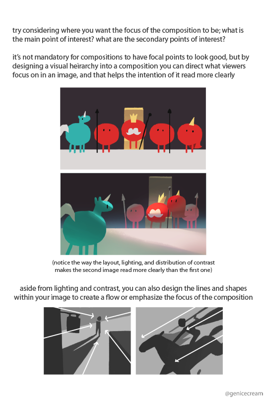
aaaaa this also is because of composition. your pieces are also fairly 'still' and lack any life or flow? different angles, perspectives, exaggerated body movements all give scenic illustrations a feeling. an example by genicecream:
then there's the basic stuff like anatomy and light source.. i really recommend looking at genicecreams tutorials owob i suggest, whenever you're doing a full piece you plan on painting, to do many, many different kind of thumbnails before actually starting. whether its on a draft paper or a sketchbook or digital-- drafting helps a lot. thumbnails are meant to be messy and quick, to get a general idea of what you want your painting to be like.
hfjfdjcjsjjfs ok i think im done for now

![]() by murmurlade » Tue Mar 28, 2017 7:25 am
by murmurlade » Tue Mar 28, 2017 7:25 am
![]() by Kyndreth » Tue Mar 28, 2017 10:11 am
by Kyndreth » Tue Mar 28, 2017 10:11 am
![]() by Nuntis » Tue Mar 28, 2017 10:15 am
by Nuntis » Tue Mar 28, 2017 10:15 am
murmurlade wrote:i can cover general topics like anatomy and lighting but could you give me a specific piece you want me to critique first? i can pinpoint composition and lighting issues much easier like that
Users browsing this forum: claudebot [Bot], YandexBot [Bot] and 0 guests