murmurlade wrote:okay!! im not a great artist myself but i am.. unfortunately pretty ok at critiquing flaws. /orz
i apologize in advance if i may sound too rude!
• focus
for majority of your paintings with backgrounds, it isn't very clear what your subject is. is it the person? the background? although the person blends with the background, they how to say? assimilate too much until it becomes unassuming.
if you are illustrating a person, it best to make sure the background and other items direct to that person in the background and that it is the /////main///// character.
• contrast and colour
majority of your paintings are very, very dark! it makes it very hard to discern any minute details you may have added; its very possible to illustrate a night sky without using dark colours.
again with the focus, i think the lack of colours/contrast causes many of your works to lack a focal point.
• composition
erm, i think this is your main problem, because the previous two points i mentioned stems from this. art does not lead the eye--- lots of negative space, my gaze is wandering around everywhere.
• flow and action
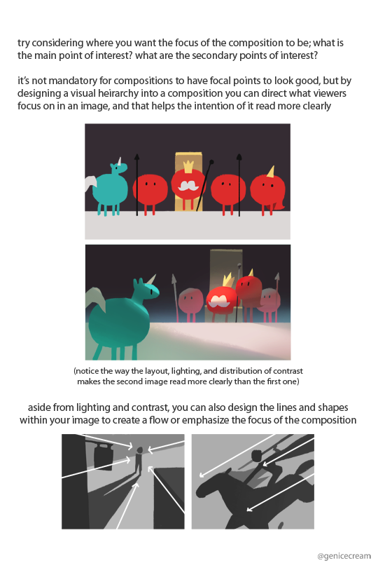
aaaaa this also is because of composition. your pieces are also fairly 'still' and lack any life or flow? different angles, perspectives, exaggerated body movements all give scenic illustrations a feeling. an example by genicecream:

then there's the basic stuff like anatomy and light source.. i really recommend looking at genicecreams tutorials owob i suggest, whenever you're doing a full piece you plan on painting, to do many, many different kind of thumbnails before actually starting. whether its on a draft paper or a sketchbook or digital-- drafting helps a lot. thumbnails are meant to be messy and quick, to get a general idea of what you want your painting to be like.
hfjfdjcjsjjfs ok i think im done for now
Thank you kindly for your critique this is probably the most detailed one I have received. I hope you don't mind, but some of it seemed a little vague with the composition part of the critique, but it helps to pick a piece so I know what I'm doing wrong.
Aside from that,Lately all I've been given is critiques of light sources, polish, and talks of possibly being able to sell what I do. (Which I honestly been doubting lately.) which is why I'm glad to have this detailed talk.As for the night sky, I've tried using brighter colors, but it just never looks right to me in a sense of what I'm going for. Not everyone is going to think the same artistically speaking of color, that's what makes us all unique from each other.
- Anatomy, is constantly improving, so I don't usually get that critique all that much,but it usually gets frustrating when I get some that tell me what it is I fix it, and another will tell me it's fine anatomically before, and I'm like "well, I'll just keep doing what I can." Anatomy seems to be usually the biggest problem amongst a lot of artists, but again that's where own judgement usually ends up falling at this point when critiques tend to clash.
Light sources is probably something I'm still looking into and trying to get better at. This has been my most current struggle since I don't think my anatomy is bad.This ones pretty consistent, and not many clash with each other here.This has always been brought up, and it seems the more I think I managed to get it down, the more I'm told that its not right? I'm still looking up references constantly, so thanks for the material, I'll look into it for future works!
Most the paintings I've done dark, is meant to be dark, honestly.but, it's mostly just is the aspect of lighting again really.I feel if I continued brightening the colors themselves, the feeling would be lost. A good example is the broken angel? I've brightened the angel at least four times, but by the fifth it didn't look quite right at all. The hope painting the one with the person in the corner with a candle in his chest, also got the treatment, but I don't think it looks terribly dark.
Personally, I do feel some do have some focus, others do not, but it depends on what or which ones your looking at because I don't think that's every piece I have done.
Edited cause it's morning xD
Like the hope piece I've made I've made two key points that most have noted as the focus.
The girl laying on the bed piece I also made, most have pointedly focused on the moon or the girl. Before looking at the other subject.
The rainbow angel is another.
The lady in the water is another most note her.
One that don't really focus
The chained girl and the reaper like angel. I know it doesn't have focus.
So if you don't mind explaining what's creating the confusion with my composition a little better would be great, choose a piece I've done which would help even more if you could point out visually. So to speak.
I really hope I didn't sound rude either.


