And your policies but that's just me.
Anyway.
The items on this site seem:
Flat
Unfinished
They don't fit with other items well
You can't shade items one way and then start shading them a new way. It makes the avatars that wear those items together look wonky.
the items also have varying density to their shading which adds to the issue. Someone who wears all items of one color might have issues because they aren't all shaded with the same density. Some literally blend into other items.
The way those Easter eggs are shaded is perfect. Why aren't the other items shaded like that?
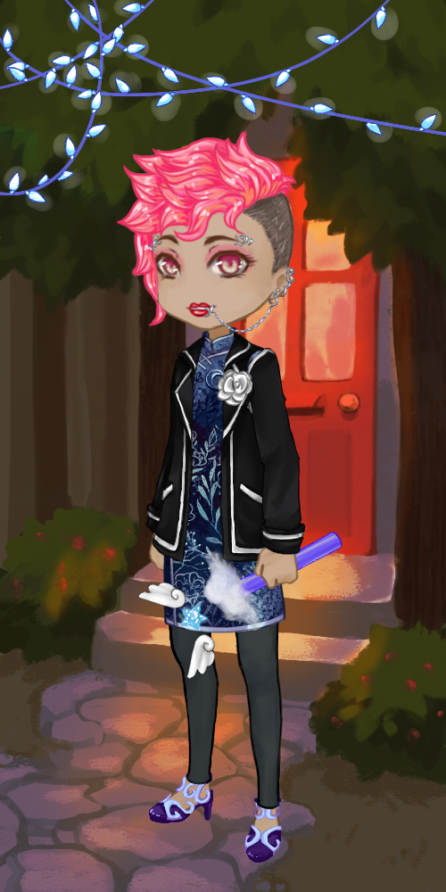
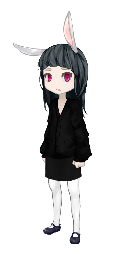
I can point out the issue just with what my avatar is wearing.
See how you can barely tell I;m not wearing some weird one piece dress? The shading is too blended so the cardigan now has no definition.
Item shading
7 posts
• Page 1 of 1
Re: Item shading
Hello! Thanks for your feedback.
What about our policy is off to you? This is an important topic, so feel free to PM me with anything you find off, or errors. It means a lot to us.
Also, I'm sorry you feel that way.
I don't know if you know this, but Windlyn was created, and is continued to be run by only TWO people, and those two people (Diana and myself) happen to only be college students who wanted to do this as a project.
Most other sites have a professional team for one thing, to collaborate and work on all the items. So they have a lot more people to do work around the site, with actual business practice in art, etc. Diana does pretty much all of our items (with a spare handful that I drew), and codes this site. She is VERY busy. I handle the PR stuff, we trade off.
So yes, you have a single person doing all of the items for this entire site. She's not a professional, but she works incredibly hard to get items out. Windlyn is also fully hand-drawn. I'm sure you noticed unlike other sites we don't use pixel art, so we ask you be a little patient.
The reason the newer items are gradually looking better and better, is because Diana is getting more experience by drawing items so frequently. So yes, some items look different than others. I'm sure in a few months, they'll look different again, who knows?
So, while we do appreciate your input, please consider how hard people are working to make this site a great community.
What about our policy is off to you? This is an important topic, so feel free to PM me with anything you find off, or errors.
Also, I'm sorry you feel that way.
I don't know if you know this, but Windlyn was created, and is continued to be run by only TWO people, and those two people (Diana and myself) happen to only be college students who wanted to do this as a project.
Most other sites have a professional team for one thing, to collaborate and work on all the items. So they have a lot more people to do work around the site, with actual business practice in art, etc. Diana does pretty much all of our items (with a spare handful that I drew), and codes this site. She is VERY busy. I handle the PR stuff, we trade off.
So yes, you have a single person doing all of the items for this entire site. She's not a professional, but she works incredibly hard to get items out. Windlyn is also fully hand-drawn. I'm sure you noticed unlike other sites we don't use pixel art, so we ask you be a little patient.
The reason the newer items are gradually looking better and better, is because Diana is getting more experience by drawing items so frequently. So yes, some items look different than others. I'm sure in a few months, they'll look different again, who knows?
So, while we do appreciate your input, please consider how hard people are working to make this site a great community.
-
- Lime
- Local time: Sun Apr 12, 2026 11:08 pm


it's good to be back
if you see me here and there
feel free to say hey

- A Lime Haiku


Re: Item shading
hmmm... Logical, I am sure these are some good suggestions and points.... but you do realize this is only an Alpha site
Perhaps PM the admins and ask how you can help .
Perhaps PM the admins and ask how you can help .
-

- Lemon Cheesecake
- online
- Local time: Sun Apr 12, 2026 8:08 pm
Re: Item shading
Then personally I would look to your users like other sites do and not just younger ones.
You'd be surprised at how many of your users are on a professional level and can bang out items like you wouldn't believe should you give them enough to work with.
Instead of slowly putting out items you know aren't the best but you tried. I get that you might be busy but in order to become successful specially since you seem to eventually want people to buy premium currency.
Also seems kinda silly to do something so HUGE and time consuming as a project when you can expect people to come and you want them to stay. This is something you plan and give yourself time to develop before letting people in.
Just seems to me like this was so rushed and as are the items that come with it. No site can work alone on one artist. Thats just insane. I just see the amounts of people that you can get into your site and make it into something more solid and the quality might hinder that.
-
- LogicalFallacy
- Local time: Sun Apr 12, 2026 10:08 pm
Re: Item shading
We are slowly, there are actually a few items that were drawn by some of our users.
Problem is, although "get people to just draw you things!" is a viable option, there's always limitations in case somebody decides to cause a ruckus. We can't pay people for their services, so everything would have to be voluntarily submitted. People would have to know that anything they submit ultimately belongs to WindlynOnline at that point- that may sound kinda weird and scary to some people, but it's true. Then we can think about turning them into items.
Also, Diana and I never intended for Windlyn to get so huge- let alone get ANY traffic. We were just having fun, two college kids, wanting to make a site that we wanted to be different from the rest, because we were sick of rude, money-grubbing websites that barely cared about their users. We adore ours.
I'm sorry you feel it's rushed, and maybe in a teensy way sometimes it is. We're a work in progress, we're still in Alpha. Sure, we could have developed a fully running site before we opened it up, but we wanted people to come and enjoy the learning process with us, and to watch it evolve alongside us. I don't think it's a bad thing.
If people want to leave because it's underdeveloped, that's their choice. We're not forcing anybody to stay. All the users here are here because they want to, they love Windlyn as much as we do, and they support us with our tiny growing website.
I do appreciate it though, really. But Diana and I are trying to learn, as well. How much can one really learn if they just get other people to do all the work for them? We are slowly opening it up to other users making items and stuff, don't worry. It all just takes time.
-

- Lime
- Local time: Sun Apr 12, 2026 11:08 pm
Re: Item shading
Yes, the shading is a little flat. Probably caused by the colours picked when shading. I noticed that the hues are really similar or the same for the shading and it makes things look unsaturated and it makes it hard for someone who's wearing different shades and values of the hue to see how it's separated.
As a member of Windlyn many other sites, I strongly believe that Windlyn is one of the nicest sites I've ever been on. There aren't many sites and social medias that care for their users and Premium currency is something that throws off the balance and creates a hierarchy where there are premium members and normal members. On many sites, it's become a huge issue because of difference in features.
I'm not an admin and as a user point of view you could say Windlyn's items aren't as pretty as Gaia's, but all the items are free. Yes, there's room for improvement but it doesn't mean it's bad and ugly to me.
-

- ShiroGEM
- Local time: Mon Apr 13, 2026 11:08 am
chris | they/them | hong kong
Hangout • Wishlist • Avis • Sketchbook • Items I've Made
Art Shop!

pixel by Mouse
Hangout • Wishlist • Avis • Sketchbook • Items I've Made
Art Shop!
pixel by Mouse
Re: Item shading
- I think a lot of users misinterpret the idea of this website. It often falls under the category of a business project as there are many avatar websites like that out there. There are indeed many different styles floating around, some look better then others. I feel like the artists are learning as they go since they've never really created items like these in the past. Give it some time, I'm sure windlyn as a fun, hobby project will turn out to be better at the end of the road.
-
- Q-tea
- Local time: Sun Apr 12, 2026 8:08 pm


7 posts
• Page 1 of 1
Who is online
Users browsing this forum: No registered users and 0 guests


